
JO Simple Modal is a powerful and flexible Joomla extension designed to automatically initialize modals for elements with a specified class. It provides a seamless way to enhance user interaction by displaying content in modal dialogs, making it easy to manage and customize modal behavior directly from the Joomla administrator panel.
Key Features:
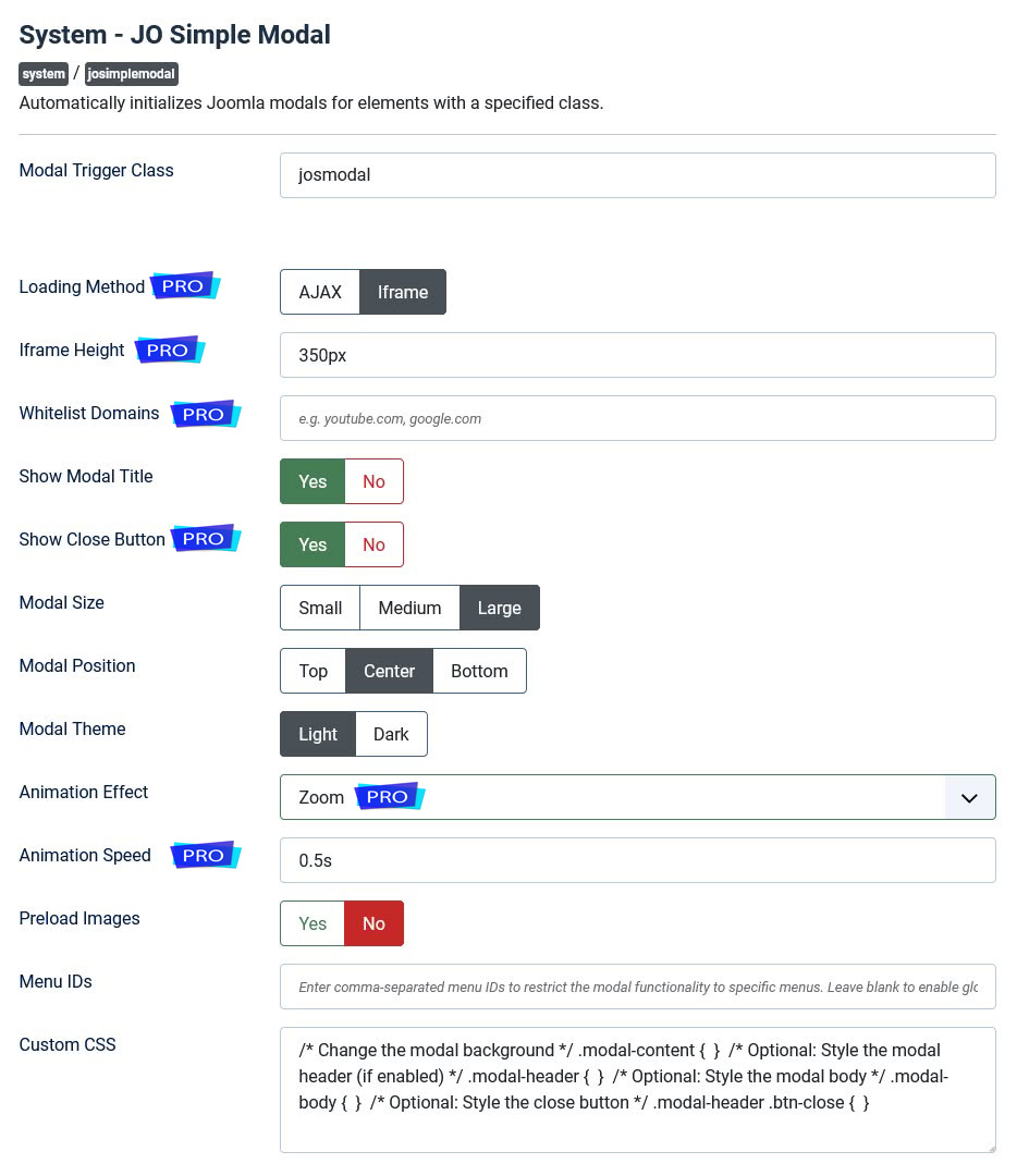
★ Customizable Modal Trigger Class: Define a CSS class to trigger modals, allowing for flexible integration with existing content.
★ Show/Hide Modal Title: Enable or disable the display of the modal title based on your preference.
★ Theme Switcher (Dark/Light): Choose between light and dark themes to match your website's design.
★ Custom CSS: Add custom CSS to style the modal popup according to your needs.
★ Restrict Modal Functionality to Specific Menu IDs: Limit the modal functionality to specific menu items, enhancing control over where modals appear.
★ Modal Size Customization (Small, Medium, Large): Select from predefined sizes to fit different types of content.
★ Modal Position (Top, Center, Bottom): Position the modal at the top, center, or bottom of the screen for optimal visibility.
★ Animation Effects (Fade, Slide): Choose from fade or slide animations to enhance the user experience.
★ Preload Images: Preload images for faster display, improving the performance of image-based modals.
★ Support for Multiple Languages: Easily add support for multiple languages by including language files.
Plugin Features:
★ Loading Method: Choose between AJAX or iframe to define how the modal should load its content.
★ Iframe Height: Set the height of the iframe.
★ Whitelist Domains: Enter a comma-separated list of domains allowed to load in the modal.
★ Separate Close Button: Show or hide the close button independently on the modal.
★ More Animation Effects: Select an animation effect for the modal from these options: Fade, Zoom, Slide From Top, Slide From Bottom, Slide From Left, and Slide From Right.
★ Animation Speed: Set the duration of the animations (e.g., 0.3s, 500ms).
★ <p> and <div> elements with class "josmodal" will also be converted to modals.
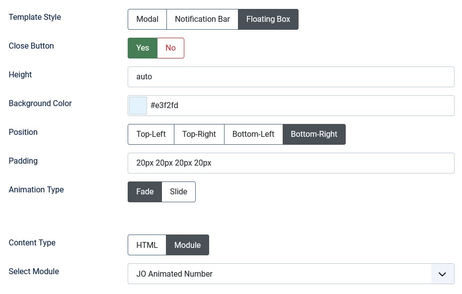
Module Features:
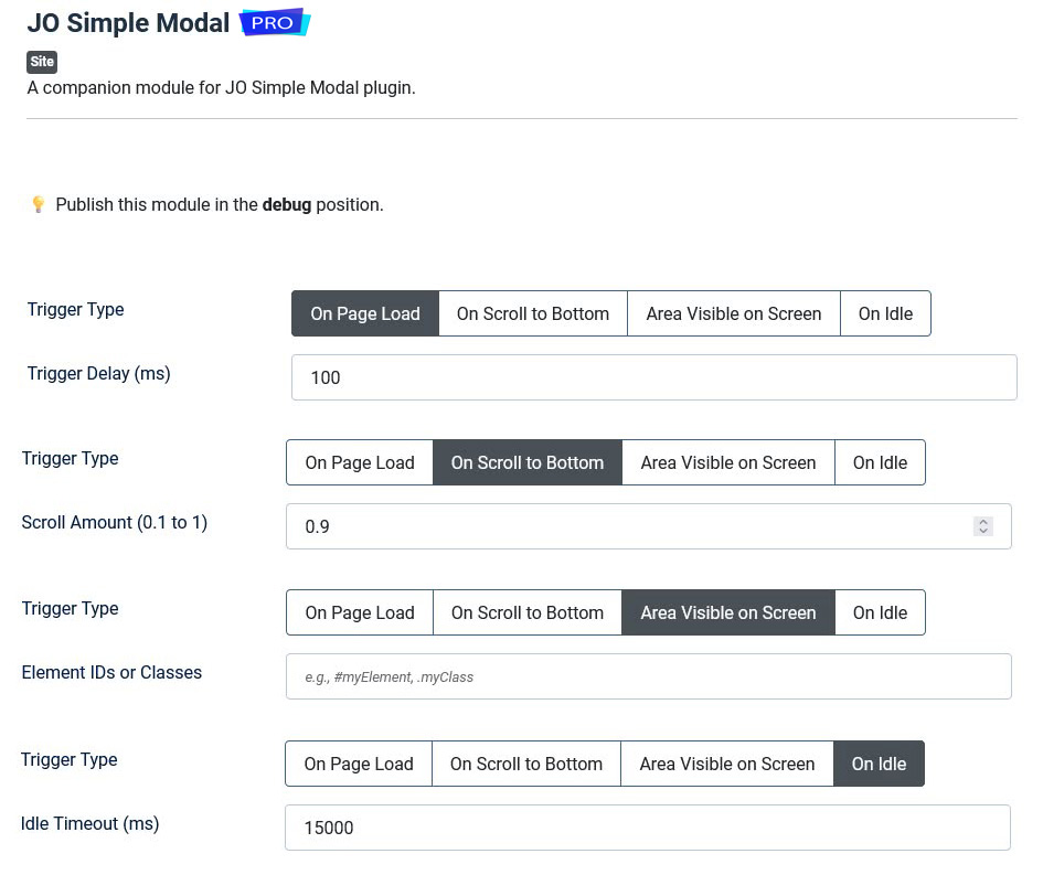
★ Four Trigger Conditions: Control when the modal/notification appears.
★★ Page Load: Open immediately (with optional delay in milliseconds).
★★ Scroll-Based: Trigger at a specific scroll position (e.g., 90% down the page). Customize the scroll threshold (0.1 = top, 1 = bottom).
★★ Element Visibility: Open when specific elements (IDs/classes) enter the viewport.
★★ User Idle: Detect inactivity (e.g., after 15 seconds) before showing the modal.
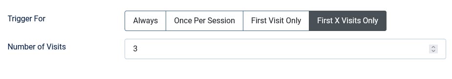
★ Frequency Control: Limit how often users see the modal/notification.
★★ Always: Show on every page load.
★★ Per Session: Show once until the browser/tab closes.
★★ First Visit Only: Only for new visitors (uses browser cache).
★★ First X Visits: Show for a set number of visits (e.g., 3 times).
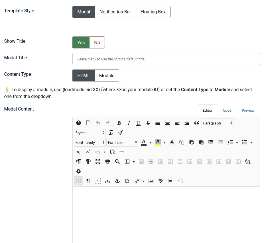
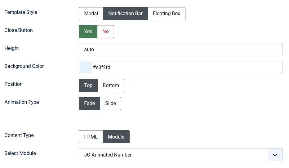
★ Display Styles: Choose from 3 templates for different use cases.
★★ Modal: Inherits all plugin features with customizable title options (show/hide) and override capability.
★★ Notification Bar: Position the notification bar at the top or bottom, with customizable height, background color, close button, and fade/slide animations.
★★ Floating Box: Position the floating box in any corner combination (top/bottom + left/right), with styling options for padding, background color, height, and close button, plus fade or slide-in animations.
★ Dynamic Content Sources: Supports full HTML content or embedding other modules.
★★ HTML Editor: Rich text editor for custom content.
★★ Module Embedding: Display content from any published Joomla module, and even use the {loadmoduleid XX} syntax for precise manual placement.
Frontend Demo:

hello world
Code Example:
<p><a href="/images/parallax-background.jpg" class="josmodal" data-title="Sample Image" data-width="800px" data-height="600px">Open Image in Modal </a></p>

<p><img src="/images/parallax-background.jpg" alt="Parallax Background" width="344" height="229" class="josmodal" /></p>

<p><img src="/images/parallax-background.jpg" alt="Click to open modal" width="344" height="229" class="josmodal" data-src="/images/parallax-background.jpg" data-title="Large Image" data-width="800px" data-height="600px" /></p>

<p><a href="/extensions/modules/jo-super-section" class="josmodal">Click</a></p>

<p class="josmodal">hello world</p>

<div class="josmodal"><span style="text-align: center; display: block; font-size: larger; font-weight: bold;">hello world</span></div>